

Elevating a cheese snack with a cult following
Whisps, the snack brand known for their ketogenic baked cheese crisps, was on a quest: they wanted to become a snack brand capable of participating in culture.
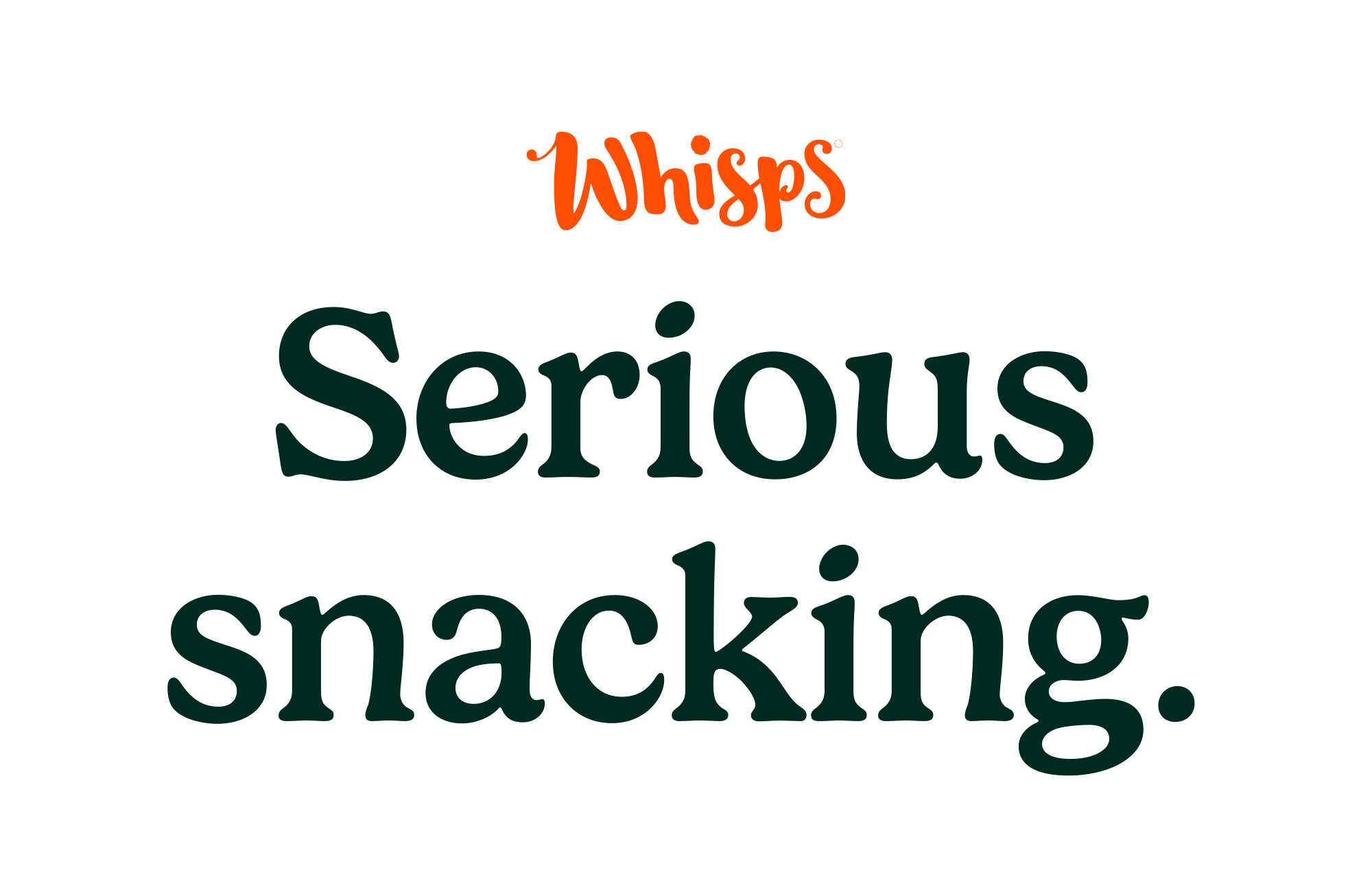
To help them get there, as part of the co:collective team, I developed a refreshed brand identity that would help Whisps reach new audiences and catalyze their mission to bring substance to snacking. Our creative platform, “A serious snack,” spoke to the serious quality and nutritional benefits of Whisps snacks, while poking fun at the concept of a snack brand that takes itself a little too seriously.
Whisps
BRAND DESIGN
ART DIRECTION
ILLUSTRATION
UI DESIGN

Before

After
Our brand system combined serious elements with playful winks that let you in on the joke.
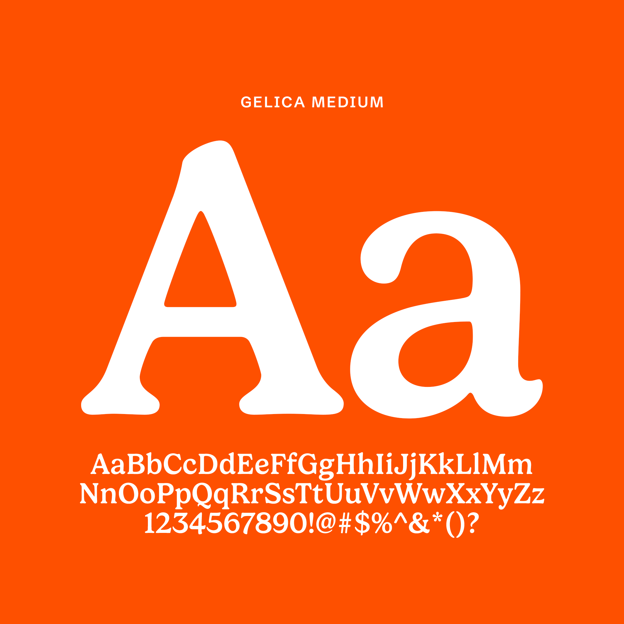
Seriously serious typefaces
We selected typefaces that appear elevated at a glance, but upon closer inspection, contain slight imperfections (just like Whisps snacks themselves).

A suite of snazzy stickers
We developed a suite of hand-drawn stickers that served two purposes: (1) a way to convey product benefits, and (2) a fun and effective way to highlight key pieces of information and inject personality into any piece of communication.

Photography that highlights every perfectly imperfect Whisp
Yes—that is my hand!


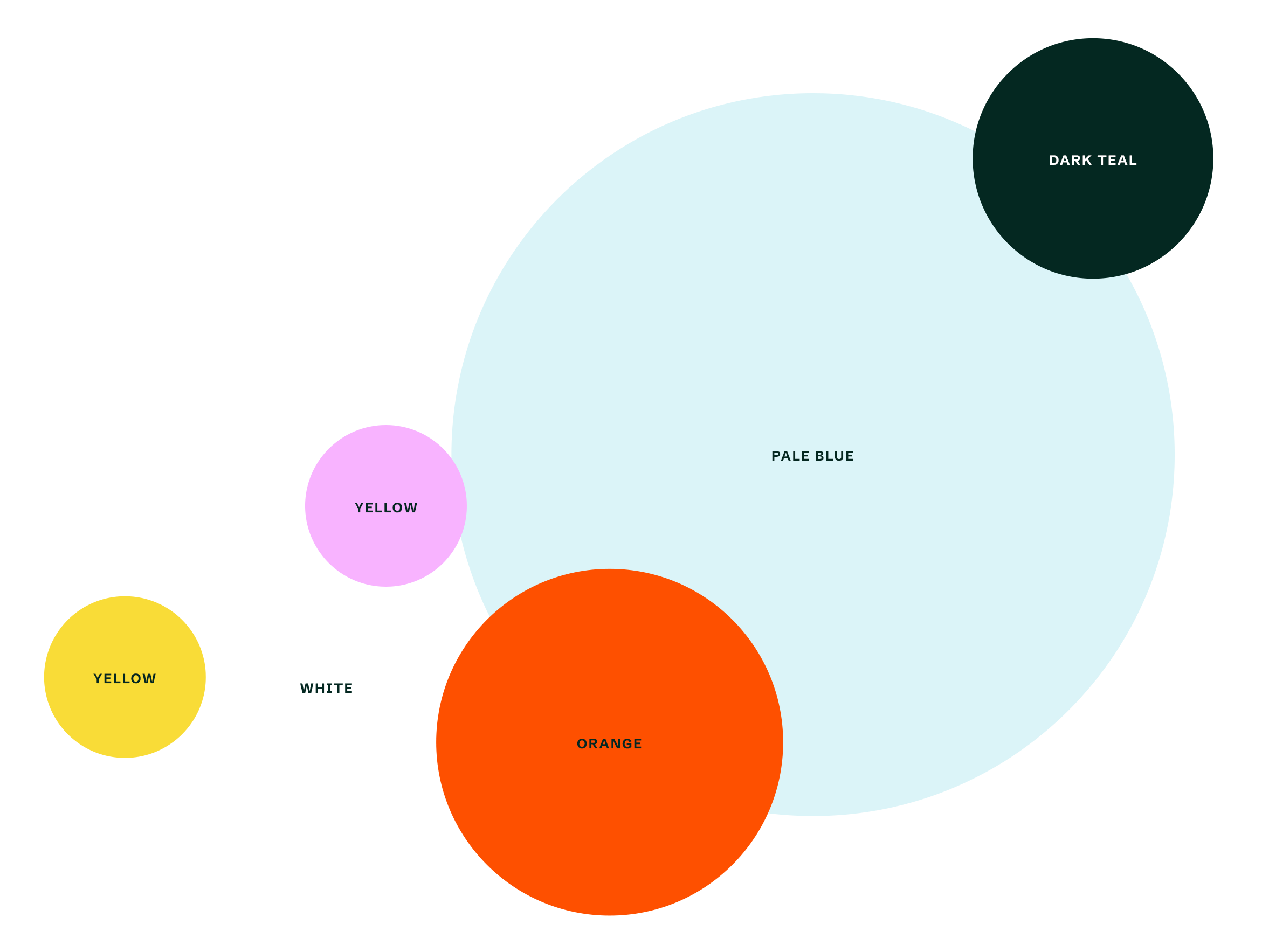
A color palette that would appeal to families and millennials
We expanded the color palette beyond orange and white, incorporating complementary colors (like blue and teal) as well as accent colors that would help the brand feel more elevated and stand out in snack aisles filled with orange and red.
The new Whisps brand in action


Credits

co:collective
Steph Price, Head of Creative Strategy
James Pacitto, ACD, Art
Charlie Glassman, ACD, Copy
Cindy Niu, Senior Designer