


Creating a space for authentic connection
Today’s social media apps incentivize passive consumption of filtered, inauthentic depictions of people’s lives, and an unhealthy fixation on metrics like followers, likes, and views. Though we are more connected, we are also more disconnected than ever before.
In 2021, I designed the brand identity and user interface for Comet, an app that was created to be the antithesis of what social media has become today. Their vision was simple: to help curious young people find authentic connection and community, and learn about themselves and the world.
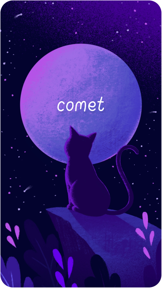
Comet
BRAND IDENTITY
ILLUSTRATION
UX + VISUAL DESIGN
How do we design an experience that feels totally different from the typical social media app?
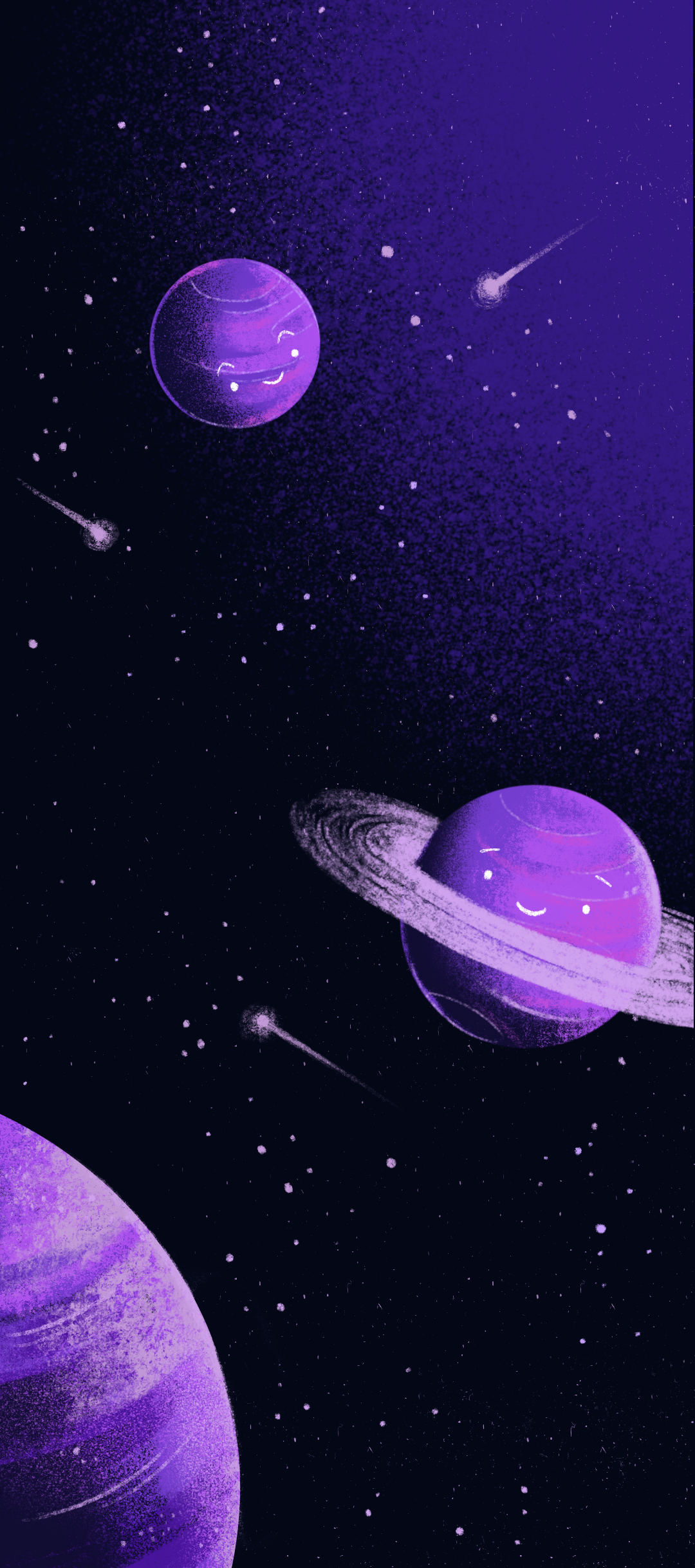
I created a set of space-themed illustrations to creative an immersive world, using hand-drawn textures, gradients, and little whimsical touches. The dark purple palette helped create an intimate, soothing mood.
The resulting effect felt different from the traditionally bright, sleek social media apps we’re used to seeing.
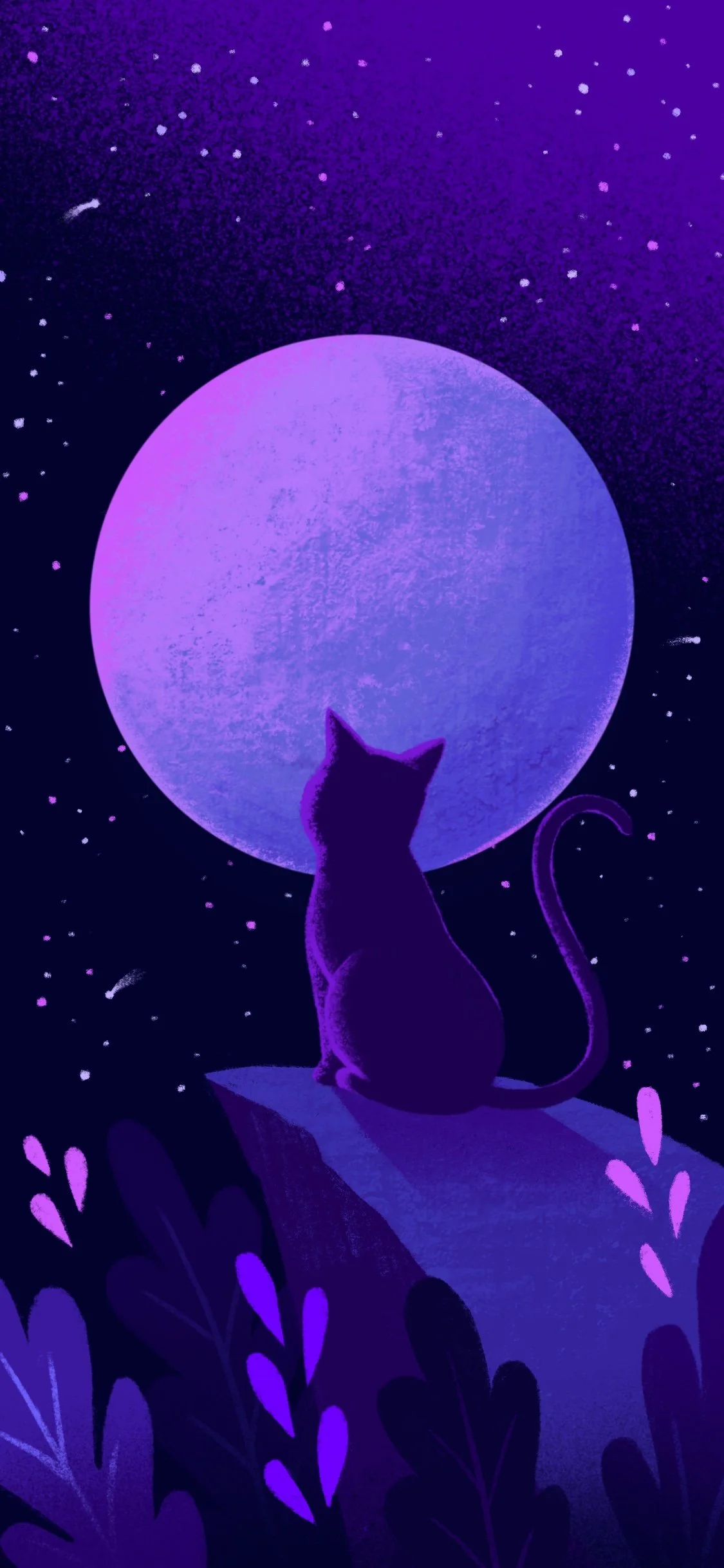

We opted for a simple, hand-drawn logo. Its simplicity wouldn’t compete with the illustrations, and it fit the friendly, young, approachable vibe we were going for. I created every letter in the alphabet in the style of the logo so we could use it as a font.


We kept the color palette primarily dark with pops of accent color for CTAs and highlighted information.

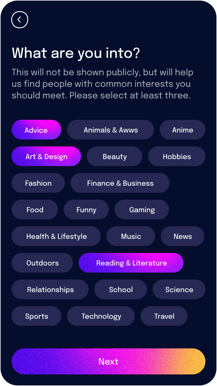
I developed an extensive UI library that included forms, button states, voice call and chat features, and a hand-drawn set of icons that matched the style of the logo.


Putting it all together

LANDING PAGE + LOADING SCREEN
A call to adventure
WAITING TO MATCH
The journey begins

MATCH LOADING SCREEN
